Pular para o conteúdo
GridBelt
  • Teste de Excel
  • Prática
  • Programas
  • Preços
Entrar
Começar o teste gratuito
  • Teste de Excel
  • Prática
  • Programas
  • Preços
EntrarCriar conta
Começar o teste gratuito
GridBelt

Pratique Excel no seu navegador.

Teste de Excel

  • Nível 1: Iniciante
  • Nível 2: Intermediário
  • Nível 3: Avançado
  • Teste de Excel em 7 dias
  • Ranking
  • Teste de Excel para entrevista
  • Avaliação de Excel da Indeed

Prática

  • Todos os exercícios
  • Programas
  • Para iniciantes

Guias

  • Fórmulas do Excel
  • Atalhos do Excel

Empresa

  • Sobre nós
  • Preços
  • Como corrigimos

© GridBelt. Todos os direitos reservados.

  • Política de Privacidade
  • Termos de Uso
  • Política de Reembolso

Excel é uma marca comercial da Microsoft Corporation. Indeed, TestGorilla, SHL e outras marcas pertencem aos seus respectivos proprietários. O GridBelt é um site de prática independente e não tem afiliação com Microsoft, TestGorilla, SHL ou Indeed, nem é endossado ou patrocinado por eles.

  1. Prática
  2. /
  3. Charts

Excel combo chart practice: revenue and margin % in one chart

  • Avançado
  • ~9 min
  • Charts

Enunciado em inglês

An outdoor-gear shop reviews its 2026 months: revenue, cost of sales and gross profit are in A1:D13. The shop was closed for a refit in February, so that month has no sales at all. The owner wants revenue and gross margin in one chart. The first attempt (chart A) and the second (chart B) are shown below; both plot the margin column E that you are about to fill.

Two charts titled "Revenue and gross margin, 2026", each with revenue as blue columns and gross margin as an orange line with markers, January to December. Revenue: Jan $41,820, Feb $0, Mar $58,430, Apr $66,910, May $74,250, Jun $88,640, Jul $94,370, Aug $91,280, Sep $70,560, Oct $63,190, Nov $72,840, Dec $89,710. Gross margin: Jan 44.1%, Feb #N/A, Mar 35.2%, Apr 33.8%, May 36.7%, Jun 32.9%, Jul 35.8%, Aug 34.1%, Sep 39.6%, Oct 41.2%, Nov 37.4%, Dec 31.8%. In the upper chart, A, both series share one dollar axis on the left from $0 to $100,000, and the margin line runs flat along the bottom. In the lower chart, B, the dollar axis on the left is unchanged and an axis on the right runs from 0% to 50%; the margin line now rises and falls across the tops of the columns. In both charts Feb has no column and no margin point: the line breaks after Jan and starts again at Mar.

O que você precisa fazer

  1. 1Gross margin is gross profit divided by revenue. Click E2 and divide D2 by B2.
  2. 2February has no revenue, so a plain division shows #DIV/0! there. Wrap it in IFERROR and give NA() as the value to show instead: the cell then shows #N/A, the value a chart leaves out.
  3. 3Fill E2 down to E13 (double-click the fill handle, or Ctrl+D / ⌘D on the selected range), then format E2:E13 as a percentage with one decimal place: Ctrl+Shift+% (Control+Shift+% on a Mac), then Increase Decimal once (in this grid: the toolbar's Increase decimal places button, under ⋮ when the toolbar is narrow; in Excel, Format Cells with Ctrl+1 / ⌘1 → Percentage → 1 decimal place works too). February stays #N/A.
  4. 4Then answer the questions about the two charts. They are pictures: this practice grid has no chart command.

Células de resposta

Questões

Escolha suas respostas aqui: o botão Verificar as corrige junto com as células de resposta.

  1. Questão 1In chart A, revenue and gross margin share one vertical axis. Why does the margin line lie flat along the bottom?

    Escolha uma resposta.

  2. Questão 2Chart B shows the same two series after one change. Which change was it?

    Escolha uma resposta.

  3. Questão 3In chart B the margin line has no point for February, because that margin cell holds #N/A. What would the chart show if the formula returned empty text ("") for February instead?

    Escolha uma resposta.

  4. Questão 4Which statements about chart B are true? Select all that apply.

    Selecione todas as alternativas que se aplicam.

Correção

Responda às questões, digite sua fórmula na grade, pressione Enter e depois clique em Verificar. Avaliamos suas respostas, o valor de cada célula de resposta e a fórmula por trás dele.

Tarefas

  1. Não verificadoIn E2:E13, compute each month's gross margin, gross profit ÷ revenue, with one formula filled down; a month without revenue must return #N/A: wrap the division in IFERROR(…, NA()) (or test the revenue with IF).
  2. Não verificadoFormat E2:E13 as a percentage with one decimal place (0.0%, for example 35.2%).
  3. Não verificadoQuestão 1: In chart A, revenue and gross margin share one vertical axis. Why does the margin line lie flat along the bottom?
  4. Não verificadoQuestão 2: Chart B shows the same two series after one change. Which change was it?
  5. Não verificadoQuestão 3: In chart B the margin line has no point for February, because that margin cell holds #N/A. What would the chart show if the formula returned empty text ("") for February instead?
  6. Não verificadoQuestão 4: Which statements about chart B are true? Select all that apply.

Recomendamos um computador para as tarefas de planilha. A planilha rola dentro desta caixa.

StartInsertFormulasDataView
A1fxPreparando sua pasta de trabalho…
A
B
C
D
E
F
G
H
I
J
1
2
3
4
5
6
7
8
9
10
11
12
13
14
15
16
17
18
19
20
21
22
Sheet1

Responda às questões, preencha as células e verifique.

Sobre este exercício

Um conjunto de dados de 12 linhas em uma planilha, uma célula de resposta, cerca de 9 minutos. Corrigido no seu navegador: o valor e a fórmula por trás dele, com feedback que mostra o que corrigir. O exercício também traz 4 questões de múltipla escolha, corrigidas pelo mesmo botão Verificar.

Como resolver

  • E2=IFERROR(D2/B2,NA())

=IFERROR(D2/B2,NA()) divides gross profit by revenue and, for February's 0 ÷ 0, returns #N/A instead of #DIV/0!; formatted as 0.0% the margins read 44.1%, 35.2% and so on. In chart A the margins (all below 0.5) share a dollar axis built for tens of thousands, so the line looks flat; chart B moves the margin to a secondary axis with its own scale from 0% to 50%. #N/A keeps February out of the line, whereas "" would be plotted as 0%. In chart B you read the margin on the right-hand axis, the crossings of line and columns mean nothing, and the best margin (January) is not the best gross profit (July).

For an existing chart, two routes in Excel 365: right-click the margin line → Format Data Series → Series Options → Secondary Axis (Windows and Mac); or select the chart → Chart Design → Change Chart Type → Combo, set Gross margin to Line and tick its Secondary Axis box (Windows). Insert → Insert Combo Chart → Clustered Column – Line on Secondary Axis builds such a chart from scratch: select A1:B13, add E1:E13 with Ctrl (⌘ on a Mac), and the margin, the second series, becomes the line. Excel 2016–2019 for Windows work the same way; the tab is called Design, under Chart Tools. Use a secondary axis for a second unit, percent next to dollars; two dollar series belong on one axis, or readers compare heights measured against different scales. Add axis titles (Chart Design → Add Chart Element → Axis Titles) so nobody reads the margin against dollars. Charts plot "" as zero, so chart data should return NA(). #N/A never becomes a point. With Select Data → Hidden and Empty Cells → Show #N/A as an empty cell ticked (new charts in Excel 365 have it on) and empty cells shown as Gaps, the line breaks at February, as in chart B; with that box cleared, it runs straight from January to March. For a table people read, a text such as n/a is friendlier (see the IFERROR margin exercise). IFERROR also hides other errors, such as a text value in a revenue cell; =IF(B2=0,NA(),D2/B2) guards only the zero.

Outras formas que funcionam

  • =IF(B2=0,NA(),D2/B2) — guards only the zero revenue and lets any other error show
  • =IFERROR((B2-C2)/B2,NA()) — the margin straight from revenue and cost of sales
  • =IF(ISERROR(D2/B2),NA(),D2/B2) — the pre-2007 pattern, same result

Respostas às questões
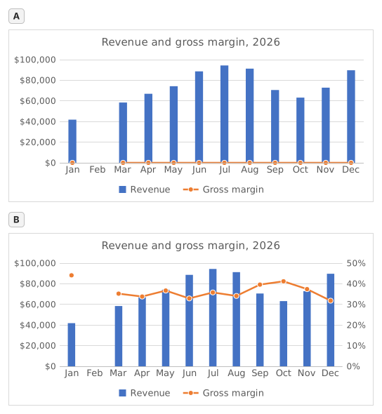
Two charts titled "Revenue and gross margin, 2026", each with revenue as blue columns and gross margin as an orange line with markers, January to December. Revenue: Jan $41,820, Feb $0, Mar $58,430, Apr $66,910, May $74,250, Jun $88,640, Jul $94,370, Aug $91,280, Sep $70,560, Oct $63,190, Nov $72,840, Dec $89,710. Gross margin: Jan 44.1%, Feb #N/A, Mar 35.2%, Apr 33.8%, May 36.7%, Jun 32.9%, Jul 35.8%, Aug 34.1%, Sep 39.6%, Oct 41.2%, Nov 37.4%, Dec 31.8%. In the upper chart, A, both series share one dollar axis on the left from $0 to $100,000, and the margin line runs flat along the bottom. In the lower chart, B, the dollar axis on the left is unchanged and an axis on the right runs from 0% to 50%; the margin line now rises and falls across the tops of the columns. In both charts Feb has no column and no margin point: the line breaks after Jan and starts again at Mar.
  1. Questão 1. In chart A, revenue and gross margin share one vertical axis. Why does the margin line lie flat along the bottom?

    Resposta: Margins below 0.5 share an axis built for dollars

    On one axis every series uses the same scale: the axis runs to $100,000 for the revenue, so margins between 31.8% and 44.1% (0.32 to 0.44 as numbers) sit a hair above zero and every change disappears. The margin did move; it only needs its own scale.

  2. Questão 2. Chart B shows the same two series after one change. Which change was it?

    Resposta: Gross margin series → Format Data Series → Secondary Axis

    Putting the margin on a secondary axis gives it its own scale on the right (0% to 50% here) while revenue keeps the dollar axis on the left. A Maximum of 1 would cut every revenue column off at the top, Display units only relabels the axis in thousands without changing the scale, and Switch Row/Column would turn the months into series.

  3. Questão 3. In chart B the margin line has no point for February, because that margin cell holds #N/A. What would the chart show if the formula returned empty text ("") for February instead?

    Resposta: A point at 0% for February

    A formula that returns "" leaves text in the cell, not an empty cell, and Excel plots text in a line or column series as 0, so the line would dive to 0% in February. #N/A is never plotted as a point: chart B shows it as an empty cell, a gap (Select Data → Hidden and Empty Cells → Show #N/A as an empty cell), and with that box cleared the line would run straight from January to March, still without a February point.

  4. Questão 4. Which statements about chart B are true? Select all that apply.

    Respostas: You read the margin on the right-hand axis e Where the line crosses a column means nothing

    The margin is plotted against the right-hand axis and the revenue against the left-hand one, so a point where the line meets a column only reflects how the two scales happen to be set. The highest margin, January's 44.1%, comes from a quiet month: July's 35.8% on far more revenue earned more gross profit ($33,780 against $18,440).

Erros comuns

Using =IFERROR(D2/B2,"") or =IFERROR(D2/B2,0): the table looks tidy, but a chart draws February at 0% and the margin line dives to the bottom; NA() keeps the month out of the chart.

Como corrigimos

Qualquer fórmula que produza o resultado certo é aceita, a menos que a tarefa cite uma função: nesse caso, outra função vale metade da pontuação. Comparamos os valores com uma pequena tolerância e ignoramos maiúsculas e espaços no texto. Um número certo digitado à mão em vez de uma fórmula vale metade da pontuação. Tarefas com várias células valem a pontuação integral com 100% das células certas e metade a partir de 50%. Quando faz diferença, também mudamos uma célula de entrada em uma cópia da sua planilha e verificamos se sua fórmula acompanha.

Respostas calculadas com as regras do Excel 365 e verificadas no nosso corretor em 20 de novembro de 2026. Autor: GridBelt team.

Nestes programas

  • Excel test in 7 days, Plano do nível 3Dia 6
  • Excel for Data AnalystsDia 11
  • Excel for Accounting and BookkeepingDia 9

Exercícios relacionados

  • Margin % without #DIV/0!Intermediário, ~6 min
  • Spot a misleading chart axis and measure the real differenceIntermediário, ~8 min
  • Share of total per region, formatted as %Iniciante, ~5 min

Referência da função

Documentação oficial