Перейти к содержимому
GridBelt
  • Тест по Excel
  • Упражнения
  • Программы
  • Цены
Войти
Начать бесплатный тест
  • Тест по Excel
  • Упражнения
  • Программы
  • Цены
ВойтиСоздать аккаунт
Начать бесплатный тест
GridBelt

Тренируйте навыки Excel прямо в браузере.

Тест по Excel

  • Уровень 1: Начальный
  • Уровень 2: Средний
  • Уровень 3: Продвинутый
  • Подготовка к тесту по Excel за 7 дней
  • Таблица лидеров
  • Тест по Excel на собеседовании
  • Тест по Excel от Indeed

Упражнения

  • Все упражнения
  • Программы
  • Для начинающих

Материалы

  • Формулы Excel
  • Горячие клавиши Excel

Компания

  • О проекте
  • Цены
  • Как мы проверяем

© GridBelt. Все права защищены.

  • Политика конфиденциальности
  • Условия использования
  • Политика возврата средств

Excel — товарный знак корпорации Microsoft. Indeed, TestGorilla, SHL и другие товарные знаки принадлежат их владельцам. GridBelt — независимый сайт для практики: он не связан с Microsoft, TestGorilla, SHL или Indeed, не одобрен и не спонсируется ими.

  1. Упражнения
  2. /
  3. Charts

Excel chart practice: spot a misleading axis that does not start at zero

  • Средний
  • ~8 мин
  • Charts

Текст упражнения на английском

A home-improvement chain surveys its customers every month. The regional manager's slide shows the 2026 satisfaction scores (0 to 100) of five stores as columns on a vertical axis that starts at 95, and one store looks far ahead of the rest; the manager wants to reward it. Before the meeting, measure the real difference in the sheet: the scores are in A1:B6 and the slide's axis minimum is in F2.

Two column charts titled "Customer satisfaction score, 2026" with the same five store scores, each column labelled: Harbor 98.6, Riverside 97.8, Station 95.9, Old Town 97.1, Airport 96.5. Chart A, as on the slide, has a vertical axis from 95 to 99, so each column shows only the part of the score above 95: Harbor's column towers over Station's. Chart B has a vertical axis from 0 to 100, and the five columns look almost the same height.

Что нужно сделать

  1. 1Click C2 and compare the store with the lowest score of all five: divide B2 by MIN($B$2:$B$6) and subtract 1. The $ signs keep MIN on all five stores when you fill down — F4 (Windows) or ⌘T (Mac) adds them.
  2. 2Fill C2 down to C6, then format C2:C6 as a percentage with one decimal place: Ctrl+Shift+% (Control+Shift+% on a Mac), then Increase Decimal once (in this grid: the toolbar's Increase decimal places button, under ⋮ when the toolbar is narrow; in Excel, Format Cells with Ctrl+1 / ⌘1 → Percentage → 1 decimal place works too). The lowest store shows 0.0%.
  3. 3On a chart, a column is drawn from the axis minimum up to its value, so its drawn height is the value minus the minimum. In F3, divide the drawn height of the tallest column by that of the shortest: (MAX(B2:B6) − F2) ÷ (MIN(B2:B6) − F2). Refer to F2 and do not type the minimum into the formula, so that F3 still works when the axis minimum changes.
  4. 4Then answer the questions; the charts are pictures, because this practice grid has no chart command.

Ячейки ответа

Вопросы

Ответы выбирайте здесь — кнопка «Проверить» оценит их вместе с ячейками ответа.

  1. Вопрос 1On the slide (chart A), Harbor's column towers over Station's. How much higher is Harbor's score really? Use your column C.

    Выберите один ответ.

  2. Вопрос 2You select the slide's vertical axis and open Format Axis (right-click the axis → Format Axis). Which change makes the columns honest?

    Выберите один ответ.

    The slide's column chart "Customer satisfaction score, 2026", narrower here, with the store names slanted; its vertical axis (95 to 99) is selected, and the Format Axis pane is open at Axis Options. Under Bounds, Minimum shows 95.0 with a Reset button next to it and Maximum shows 99.0 with an Auto button; under Units, Major shows 1.0 and Minor 0.2, both Auto.
  3. Вопрос 3In which of these charts is a value axis that does not start at 0 acceptable? Select all that apply.

    Выберите все подходящие варианты.

Обратная связь

Ответьте на вопросы, введите формулу в таблицу, нажмите Enter, а затем «Проверить». Мы оцениваем ваши ответы, значение в каждой ячейке ответа и формулу, которая его даёт.

Задания

  1. Не провереноIn C2:C6, compute how much higher each store's score is than the lowest of the five scores, as a share of the lowest — score ÷ lowest − 1 — with one formula filled down.
  2. Не провереноFormat C2:C6 as a percentage with one decimal place (0.0%, for example 1.2%).
  3. Не провереноIn F3, compute how many times taller the tallest column is drawn than the shortest on an axis that starts at the value in F2: (highest score − F2) ÷ (lowest score − F2).
  4. Не провереноВопрос 1: On the slide (chart A), Harbor's column towers over Station's. How much higher is Harbor's score really? Use your column C.
  5. Не провереноВопрос 2: You select the slide's vertical axis and open Format Axis (right-click the axis → Format Axis). Which change makes the columns honest?
  6. Не провереноВопрос 3: In which of these charts is a value axis that does not start at 0 acceptable? Select all that apply.

Для заданий в таблице рекомендуем компьютер. Лист прокручивается внутри этой области.

StartInsertFormulasDataView
A1fxГотовим вашу рабочую книгу…
A
B
C
D
E
F
G
H
I
J
1
2
3
4
5
6
7
8
9
10
11
12
13
14
15
16
17
18
19
20
21
22
Sheet1

Ответьте на вопросы, заполните ячейки и проверьте.

Об этом упражнении

Набор данных (строк: 5) на одном листе, 2 ячейки ответа, около 8 мин. Проверка прямо в браузере: значение и формула, которая его даёт, с обратной связью о том, что исправить. Также в упражнении есть 3 вопроса с выбором ответа — их проверяет та же кнопка «Проверить».

Как решить

  • C2=B2/MIN($B$2:$B$6)-1
  • F3=(MAX(B2:B6)-F2)/(MIN(B2:B6)-F2)

Harbor's score is only 2.8% above Station's (=B2/MIN($B$2:$B$6)-1), but on an axis that starts at 95 a column only shows the part of its value above 95, so Harbor's 3.6 points against Station's 0.9 draw a column 4.0 times as tall (F3). With the axis from 0 the drawn heights are the real values and the ratio falls to 1.03. The fix is to type 0 as the axis Minimum; a non-zero axis is acceptable for lines and dots, which show values by position rather than by length.

In Excel, right-click the vertical axis → Format Axis → Axis Options → Bounds and type 0 in Minimum (the same pane on Windows and Mac, and in Excel 2016–2021). When a bound is on Auto, Excel chooses it: if the smallest value is above about five sixths of the largest, the automatic minimum is not 0, so five scores between 95.9 and 98.6 get a cut axis even if nobody set one, and Reset only returns to that automatic value. The picture shows a 300% difference where the data has 2.8%; Tufte called the ratio of the two the lie factor. When small differences matter, chart them directly: columns of each store's gap to the lowest store or to a target, a dot plot, or a line with a clearly labelled axis. Pitfall: =B2/MIN(B2:B6)-1 without $ slides the MIN range down as you fill, so the stores below Station are compared with a different "lowest" score.

Другие рабочие способы

  • =B2/MIN(B$2:B$6)-1 — locking the rows is enough when you only fill down
  • =(B2-MIN($B$2:$B$6))/MIN($B$2:$B$6) — the same, written as (score − lowest) ÷ lowest
  • =(MAX(B2:B6)-$F$2)/(MIN(B2:B6)-$F$2) in F3 — the same with F2 locked

Ответы на вопросы
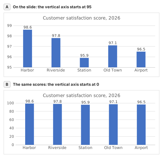
Two column charts titled "Customer satisfaction score, 2026" with the same five store scores, each column labelled: Harbor 98.6, Riverside 97.8, Station 95.9, Old Town 97.1, Airport 96.5. Chart A, as on the slide, has a vertical axis from 95 to 99, so each column shows only the part of the score above 95: Harbor's column towers over Station's. Chart B has a vertical axis from 0 to 100, and the five columns look almost the same height.
  1. Вопрос 1. On the slide (chart A), Harbor's column towers over Station's. How much higher is Harbor's score really? Use your column C.

    Ответ: About 3% higher

    Harbor scores 98.6 and Station 95.9, so Harbor is 98.6 ÷ 95.9 − 1 ≈ 2.8% higher. On the slide each column only shows the part above 95: 3.6 points against 0.9, which draws Harbor's column 4.0 times as tall.

  2. Вопрос 2. You select the slide's vertical axis and open Format Axis (right-click the axis → Format Axis). Which change makes the columns honest?

    Ответ: Type 0 in the Minimum box

    Columns show a value by their length from the axis, so the axis must start at 0 for the lengths to compare. Reset is not enough: when every value is above about five sixths of the largest one, as here, Excel's automatic minimum is not 0 either. Data labels print the true numbers but leave the misleading lengths.

  3. Вопрос 3. In which of these charts is a value axis that does not start at 0 acceptable? Select all that apply.

    Ответы: A line chart of a share price moving between $95 and $99 и A scatter chart of house size against sale price

    Columns and bars show a value by their length, so a cut axis turns small gaps into big ones. Lines and dots show a value by its position, so their axis may zoom into the range where the values move, as long as its labels show where it starts.

Частые ошибки

Filling =B2/MIN(B2:B6)-1 down without $: in the rows below Station the MIN range no longer includes Station's score, so those stores are measured against the wrong lowest store.

Как мы проверяем

Принимается любая формула, которая даёт верный результат, если только задание не называет функцию: тогда другая функция даёт половину балла. Мы сравниваем значения с небольшим допуском и не учитываем регистр и пробелы в тексте. Верное число, введённое вручную вместо формулы, даёт половину балла. Задания с несколькими ячейками получают полный балл, если верны 100% ячеек, и половину — если верны от 50%. Там, где это важно, мы также меняем входную ячейку в копии вашего листа и проверяем, что формула пересчитывается правильно.

Ответы рассчитаны по правилам Excel 365 и 20 ноября 2026 г. сверены в нашей системе проверки. Автор: GridBelt team.

Похожие упражнения

  • Read a clustered column chart of revenue by regionНачальный, ~6 мин
  • Year-over-year % changeНачальный, ~4 мин
  • Revenue and margin % in one readable chartПродвинутый, ~9 мин

Справка по функции

Официальная документация

Следующее упражнение

Series or categories? Read a chart both ways and flip its table